Minimalism
Minimalism is not a poor style — it is a demanding one. It emerged in art during the 1960s (Donald Judd, Dan Flavin) and transferred into architecture with John Pawson and Claudio Silvestrin in the 1990s. Its premise is radical: every element that does not contribute to function must be eliminated. The result is not emptiness — it is silence.
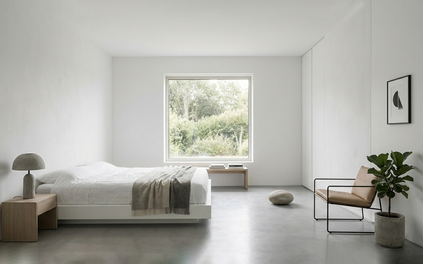
Empty space is a positive design element, not an absence. Every object in a minimalist space must justify its presence: it carries a precise formal or functional value, or it is not there at all. Surfaces are continuous and uninterrupted; joints between different materials are concealed; electrical sockets are integrated into the wall; doors are flush with the plaster. The palette is near-monochromatic — white, fog grey, warm beige — with material texture providing the only variation. The most rigorous practitioners: John Pawson, Tadao Ando, Claudio Silvestrin.
"Silence is the sound beauty makes when there is nothing left to add."
— John Pawson, minimalist architectProf. Vincenzo Pazzi
Scandinavian
The style that conquered the world through IKEA, yet is rooted in a refined and deep design philosophy. The Nordic design tradition — Swedish, Danish, Norwegian, Finnish — responds to a real problem: how to live well in environments with little natural light, long winters and extreme climates. The answer is white, light wood, soft textiles and an ethic of hygge — domestic warmth as a cultural value.
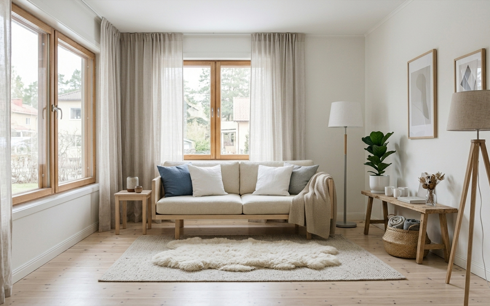
Light wood — pine, birch, ash — is the dominant element, and is not varnished but treated with natural oils to leave the grain visible. Textiles are fundamental: wool, cotton, linen in neutral colours bring the warmth that cool surfaces cannot provide. The Danish concept of hygge — difficult to translate, somewhere between wellbeing, conviviality and comfort — guides every choice: candles, cushions, blankets, rugs. The palette is light (pure white, light grey, wool beige, natural wood) with accents of ultramarine blue or sage green. Artificial lighting is layered and dimmable — never a single strong central source.
"Danish design is not a style — it is a way of thinking about the world."
— Arne Jacobsen, designerProf. Vincenzo Pazzi
Japandi
Japan + Scandinavia: the encounter between two cultures of the essential, which proves deeper than it first appears. Both value simplicity, natural materials and function as aesthetics. The difference lies in philosophy: the Nordic brings warmth (hygge), the Japanese brings silence and an awareness of impermanence (ma). Japandi is the most sophisticated balance that contemporary design has found between these two worlds.
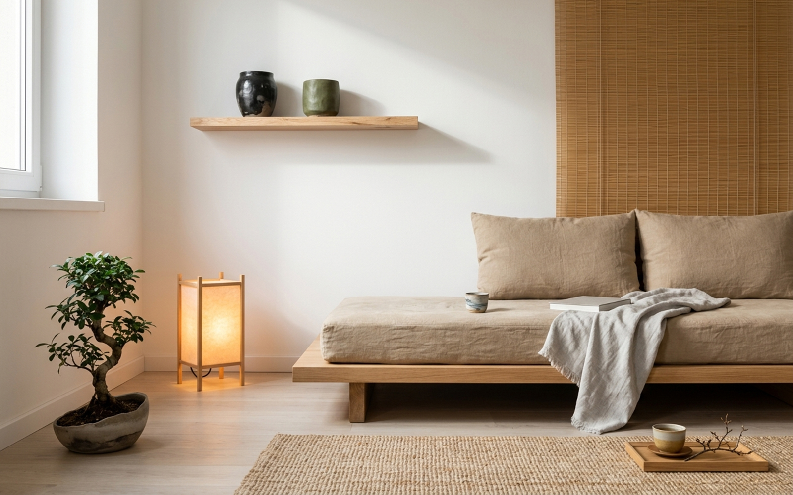
Japandi synthesises the Japanese ma — negative space as an active element — with Scandinavian tactile comfort. Surfaces are matt (no high-gloss lacquer), materials are always natural, forms are simple but carefully detailed. The difference from pure minimalism lies in the presence of warmth: the wood is slightly darker than Scandinavian, the ceramics are handmade with deliberate imperfections, textiles are reduced but present. The palette concentrates on ash grey, sand beige, moss green, ink black — with emphasis on contrast rather than monochromatism.
"Simplicity is the ultimate form of sophistication."
— Leonardo da VinciProf. Vincenzo Pazzi
Wabi-Sabi
& Zen
Wabi-Sabi is not a design style — it is a millennial Japanese aesthetic philosophy that finds its core values in imperfection, incompleteness and impermanence. Wabi: beauty in rustic simplicity. Sabi: beauty that comes with time and wear. Translated into interiors, it means: do not conceal imperfections, celebrate them. A cracked wall, a broken piece of pottery repaired with gold (kintsugi), wood darkened with age: these are its materials of choice.
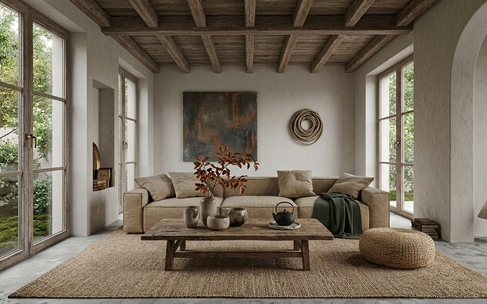
In a Wabi-Sabi interior, perfection is not the goal — authenticity is. Walls may show irregularities in the plaster, wood may be old and worn, flowers may be wilted in a rough ceramic vase. The palette is that of nature in decay: stone grey, ochre beige, rust, dark moss green, charcoal black. No surface is mirror-smooth; every reflection is matt and absorbed. The most common Western mistake is to confuse Wabi-Sabi with neglect — on the contrary, it demands extreme care in the selection of every element and in the composition of spaces.
"Nothing is permanent, nothing is complete, nothing is perfect."
— Wabi-Sabi foundational principlesProf. Vincenzo Pazzi