Reading
an Interior
Style is a system, not a catalogue of objects
Entering a space and recognising its style requires a method. It is not about identifying a single element — a lamp, a cladding material, a colour — but about reading the coherence between all the choices made. Style is the result of a system of visual relationships. Change a single element in an inconsistent way, and the harmony breaks.
"Design is the silence between things, not the things themselves."
— John Pawson, architectWhen analysing an interior, one always asks the same questions: what is the communicative intention of this space? Is there coherence between materials, forms and colours? How is visual weight distributed across the elements? Where does the eye travel, and why? Answering these questions is the first step towards designing with awareness.
Prof. Vincenzo Pazzi
The 7 Constituent
Elements
Every style is the specific combination of these seven elements
There are no styles without rules: every stylistic current — from Baroque to Japandi — is distinguished by how it combines these seven fundamental elements. Learning to recognise and handle them is the prerequisite for any conscious design work.
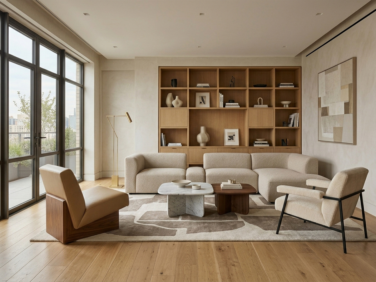
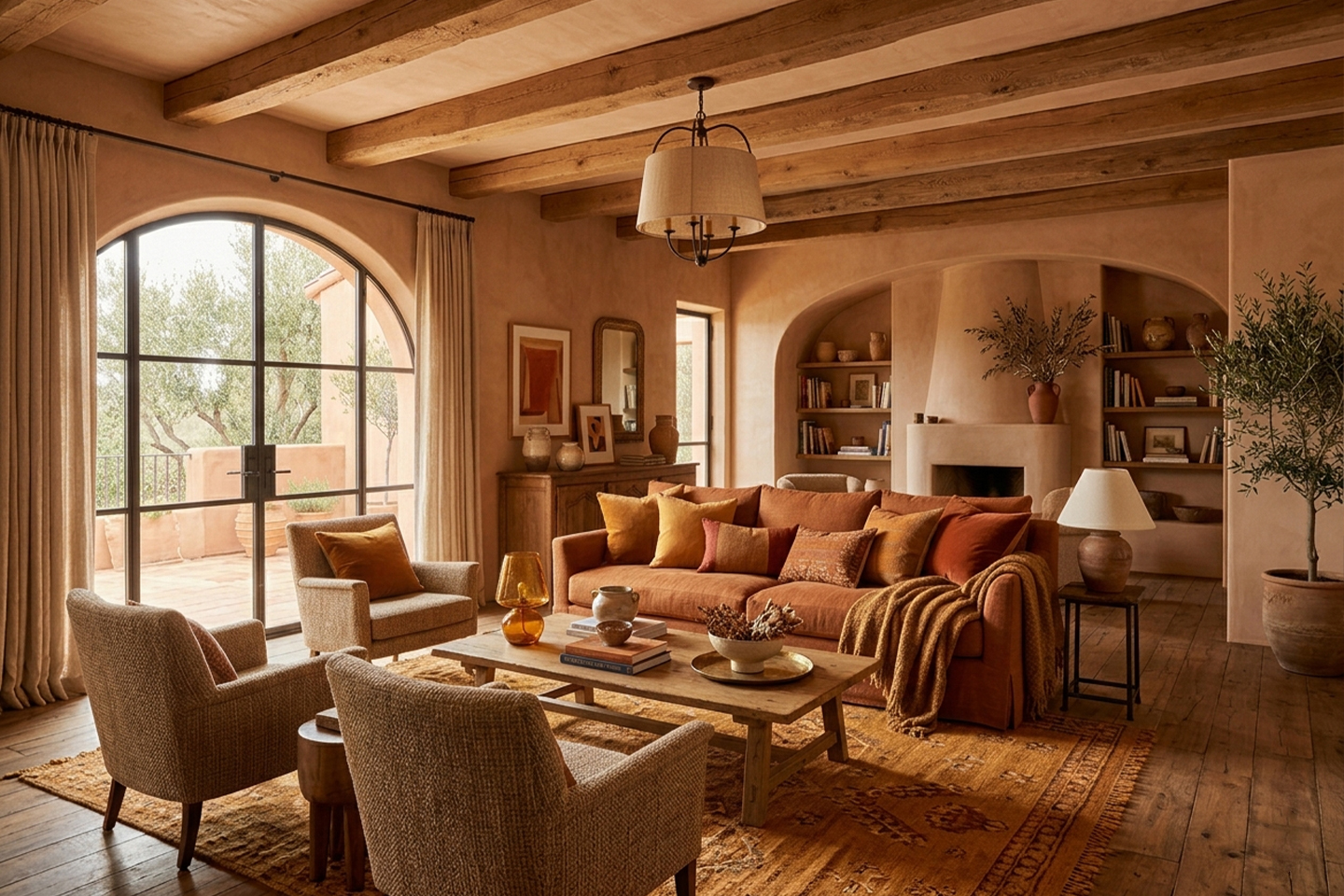
The outline of objects and spaces. It can be geometric or organic, symmetrical or asymmetrical. Each style favours a precise formal repertoire: the Baroque loves the curve, Minimalism favours the straight line.
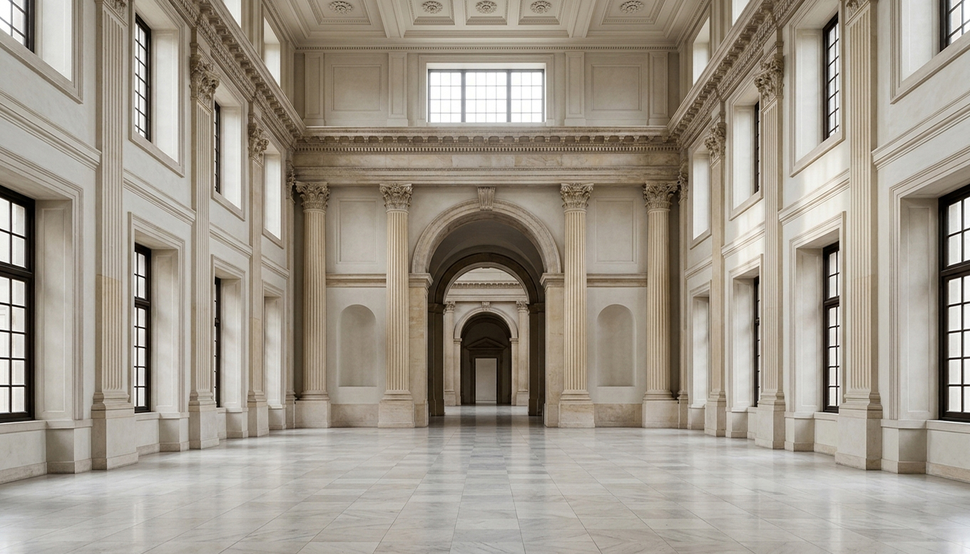
The scale relationship between elements and between furniture and space. A space with wrong proportions feels uncomfortable even if individual pieces are beautiful. The golden ratio and Le Corbusier's Modulor are historical examples.
The element with the greatest immediate emotional impact. It defines temperature, visual weight and atmosphere. Covered in detail in the following sections of this chapter.
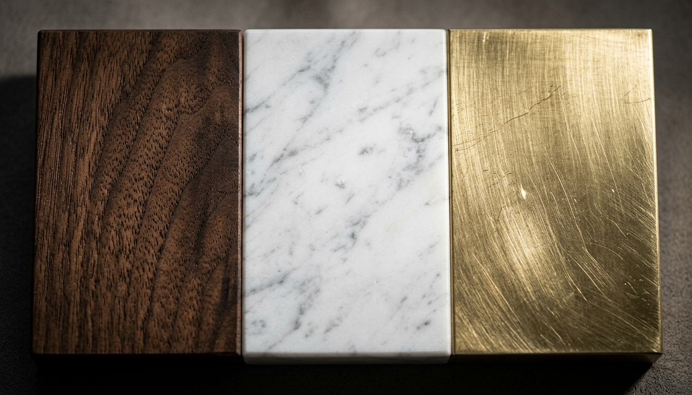
The concrete matter from which objects are made: wood, metal, stone, glass, fabric, plastic. Each material carries a repertoire of cultural and sensory associations that contributes to the reading of style.
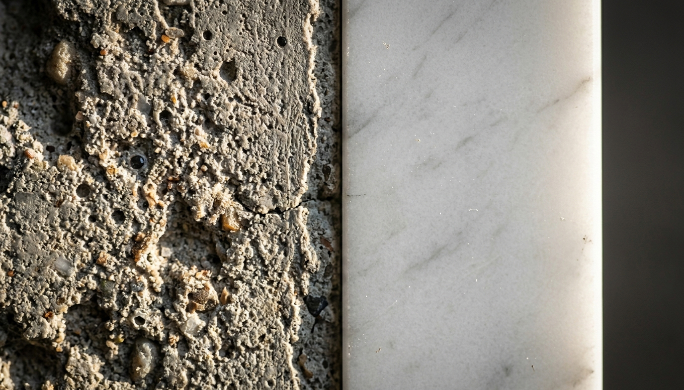
The surface of objects: smooth or rough, matt or glossy, uniform or varied. Texture adds visual depth and a tactile quality. An all-smooth, glossy interior conveys very different sensations from a rough, matt one.
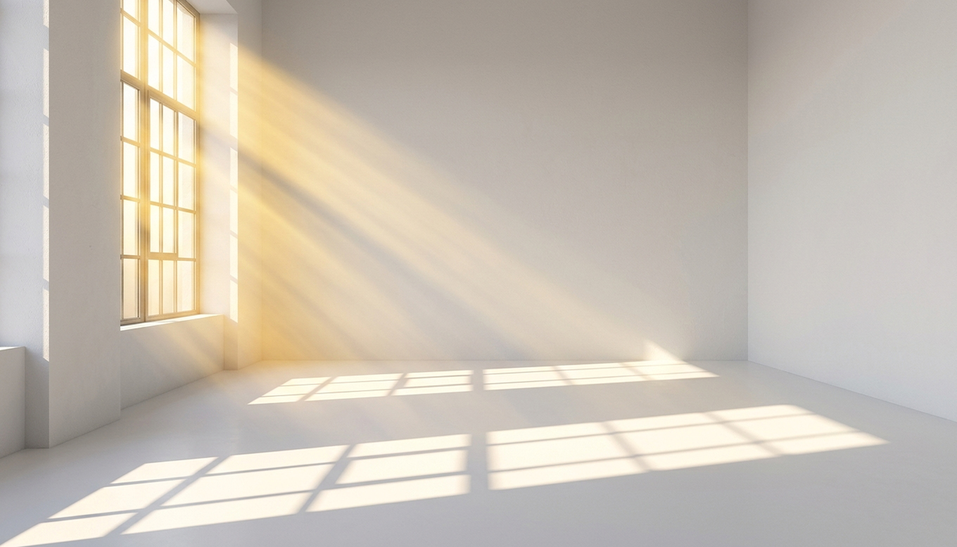
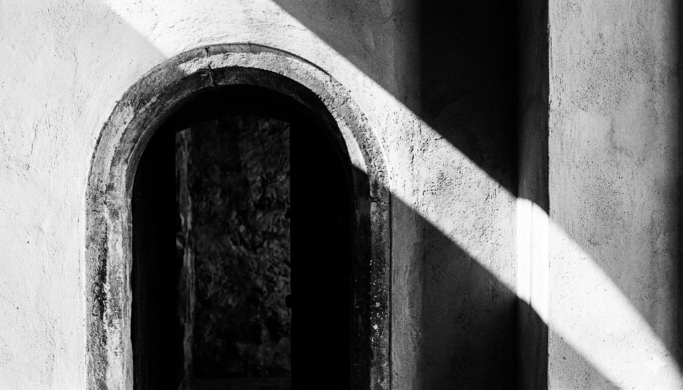
Natural and artificial light radically transforms the perception of a space. Direct or diffuse, warm or cool, dramatic or functional: light is the invisible material that completes every project.
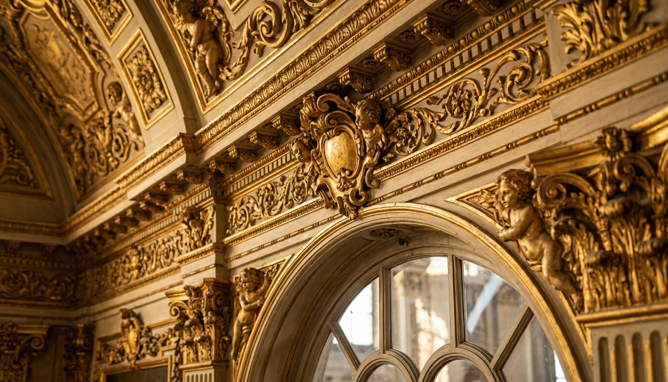
The deliberate presence or absence of decoration. The Baroque accumulates it; Minimalism eliminates it. The degree of ornament is one of the most immediate stylistic markers for classifying an interior.
Prof. Vincenzo Pazzi
Colour as
a Tool
You don't choose a colour — you design a relationship between colours
Colour in interior architecture does not work as it does in painting or fashion. You are working with continuous surfaces and environments that change with natural light throughout the day. A colour never exists on its own: it is always in relation to adjacent surfaces, materials and light sources. Designing colour means designing these relationships.
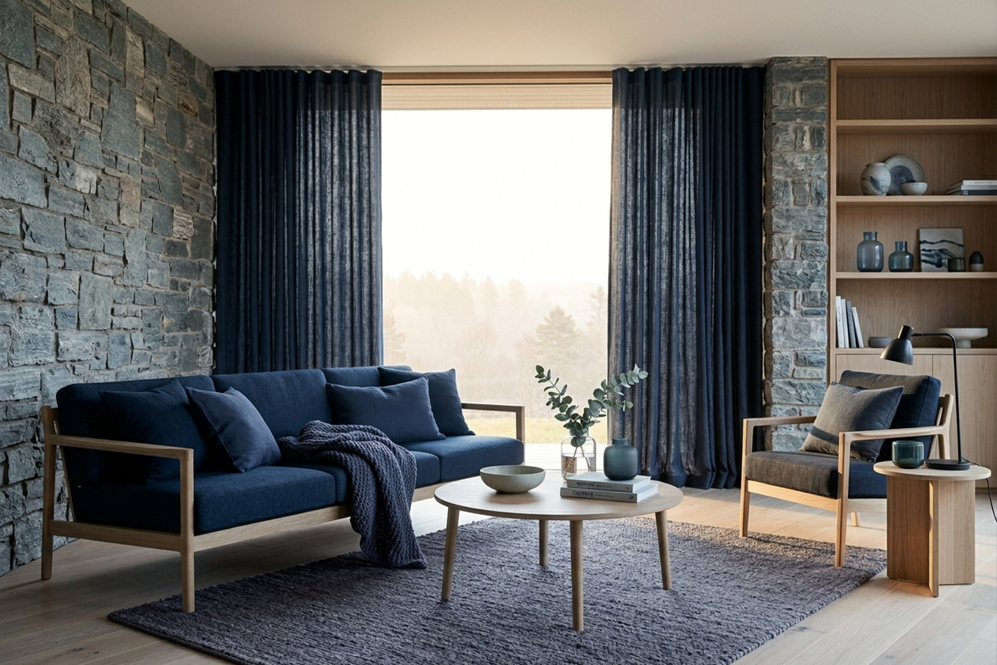
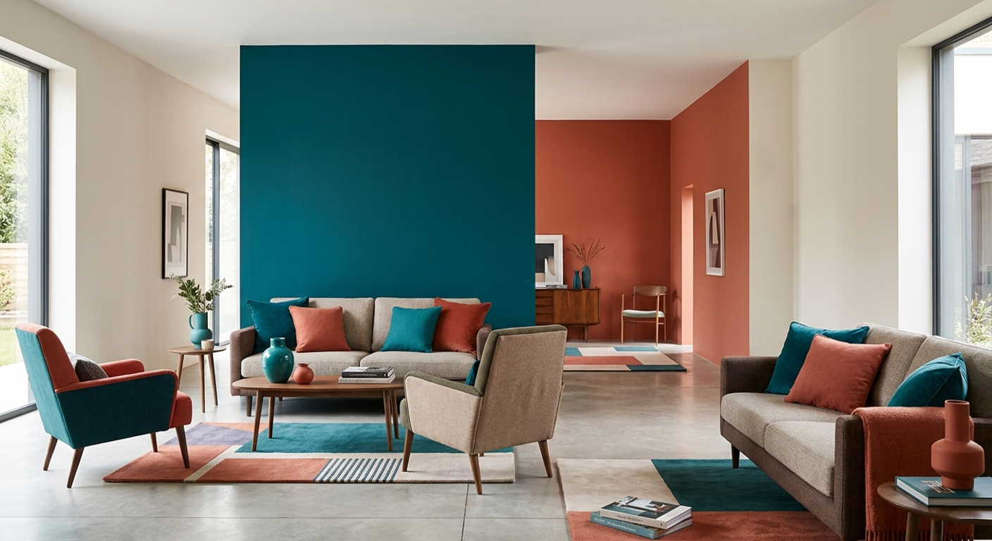
The 60–30–10 Rule
The most robust professional rule for balancing colours in an interior. Not a rigid formula, but a starting proportion that avoids the most common imbalances.
| Share | Where it applies | How to choose |
|---|---|---|
| 60% | Walls, flooring, ceiling. The background of the project. | A neutral or base colour. Must work with the natural light of the space. Often lighter than one imagines. |
| 30% | Main furniture, curtains, upholstery. | Can be more characterised than the dominant. Creates contrast without dominating. Often complementary or analogous to the 60%. |
| 10% | Cushions, decorative objects, hardware details, artworks. | Here you can be bold. A vivid accent works precisely because it is contained. Often the most saturated colour in the whole composition. |
Prof. Vincenzo Pazzi
Building
the Palette
Four types of palette, one common logic
A colour palette is not a list of colours you happen to like: it is a system in which each colour plays a precise role. There are four fundamental types of palette, each with a different internal logic and a distinct atmospheric effect. Knowing all four allows you to choose the most appropriate one for the project — and to use it consciously.
01 — Monochromatic Palette
Uses a single colour across all its tones. Creates sophisticated, unified atmospheres. Requires textural variation to avoid monotony.
02 — Analogous Palette
Uses adjacent colours on the colour wheel. Harmonious and natural, it evokes the natural environment. Ideal for relaxing and coherent interiors.
03 — Complementary Palette
Uses opposite colours on the colour wheel. Creates visual tension and vibrancy. Must be used with the 60–30–10 rule: the complementary colour should be the accent.
04 — Neutrals + Accent (the most versatile)
The neutral base with a single chromatic accent is the most flexible, enduring solution. It resists trends and adapts easily to changes in furnishings over time.
Prof. Vincenzo Pazzi
The Professional
MoodBoard
Not a collection of nice images — a design document
The MoodBoard is the most effective communication tool between designer and client in the early phase of a project. It is not a Pinterest board of images you happen to like: it is a structured document that communicates a precise intention — the stylistic direction, the material quality, the overall atmosphere of the space to be realised.
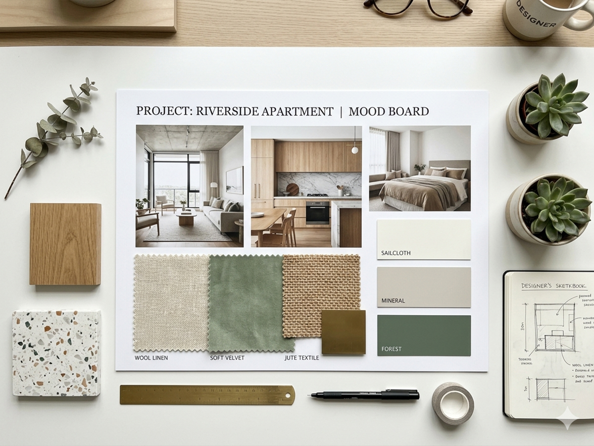
A professional MoodBoard is always composed of the same elements, combined with deliberate visual balance:
An image of an existing environment that captures the desired atmosphere. It does not need to be identical to the project, but must convey the right emotion.
5 colour swatches with HEX code and name. 60-30-10 application indicated.
Texture swatch. Commercial name, finish, reference supplier.
Intended use: kitchen and bathroom surfaces. Polished finish.
Image / sketch of the main piece. Dimensions and manufacturer.
How to build it: 5 steps
Collect without filtering everything that resonates with the atmosphere you are seeking. Architecture images, nature, fashion, art, objects. The source does not matter: what matters is the emotion conveyed.
Reduce the images to those that share a common denominator: tone, material, atmosphere. Eliminate everything that breaks coherence, even if it is beautiful on its own.
Extract recurring colours from the selected images. Use a pipette tool (Photoshop, Coolors, Adobe Color) to get precise HEX values. Order colours by role: dominant, secondary, accent.
Add real or photographic material swatches. The MoodBoard must allow the client to imagine the touch as well as the look. Name each material with precision.
Arrange elements with a precise visual logic. Add the concept sentence: a single phrase summarising the intention of the project. It should be evocative, not descriptive.
Prof. Vincenzo Pazzi